03 — Logo
The logo, and how to give it room.
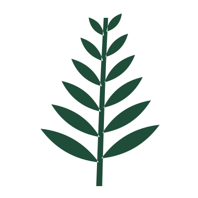
A fern mark and a lowercase wordmark set in Fraunces. Use the files from Downloads; never redraw or retype it.
Versions
Three versions, one for every surface.
fernway
Primary — Pine on Paper
fernway
Reversed — Paper on Pine

Mark — app icons and avatars
Clear space
Give it the height of the f on every side.
Dashed line = clear space (x on every side)
Minimum sizes
Small is fine. Too small is not.
fernway
Screen — 24 px tall
Navigation bars, emails, favicons use the mark
fernway
Print — 12 mm wide
Business cards, labels, receipts
fernway
Embroidery — 18 mm wide
Caps, jacket chests, bag patches (new in v2.1)
Backgrounds
Pine on light, Paper on dark. That’s the rule.
fernway
✓
Paper background

fernway
✓
Pine background

fernway
✓
Calm photo area
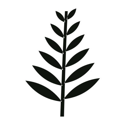
fernway
✕
Clay is for accents, not logos
Misuse
Eight things we’ve seen, and never want to see again.
fernway
✕
Don’t rotate it
fernway
✕
Don’t recolour it
fernway
✕
Don’t rearrange the parts
fernway
✕
Don’t retype the wordmark

fernway
✕
Don’t place it on busy photos
fernway
✕
Don’t use low contrast
NEW SEASON
fernway
✕
Don’t crowd the clear space
fernway
✕
Don’t put it in a coloured box
04 — Next